SAI Rebrand Case Study
Evolving a brand goes beyond redesigning a logo — it’s about creating a visual identity system that’s scalable, consistent, and trusted. My goal for SAI was to create a flexible branding identity that would grow with them.
This goal behind the rebranding initiative was to breathe new life into the SAI brand while creating a design system to accommodate their growing portfolio.
Project: Rebrand SAI’s visual identity
My Role: Art direction, branding, graphic design, animation
Collaboration: Executive leadership team, marketing, external web development team
Timeline: 3 months
Company: The SAI Group
Key Results: Elevated brand clarity, consistency, credibility, driving engagement and growth
The Challenge
SAI’s brand faced deep-rooted identity challenges. The logo was outdated and didn’t reflect its growth or expertise. Beyond that, there was no cohesive system — inconsistent colors, typography, and iconography created a fragmented visual language.
The issue was compounded by poorly integrated acquisitions, each bringing its own style without unification. This resulted in a disjointed, confusing brand that diluted credibility and made it difficult to understand who SAI is and what it stands for.
A strategic, foundational rebrand was needed to unify and modernize the brand.
Logo Design
Broad exploration and refinement: I started with lenient guidelines, giving me the freedom to explore multiple design paths through low fidelity sketches. I tested broad themes representing different aspects of the brand — chemistry, biology, global, healthcare, data / analysis, navigation, and knowledge to hone in on concepts that would resonate.
Collaborative ideation: Engaging stakeholders at every stage kept me aligned on objectives. Rather than presenting a final design without input, I worked alongside senior leadership to ensure the project stayed focused and that feedback was effectively incorporated.
Virtual workshops: Key workshops I hosted over Microsoft Teams allowed us to define and align on the final direction. These sessions gave me insights into how to best visually represent SAI’s vision.
Design finalization and logo design system: With all necessary feedback in hand, I created the final logo — logomark and wordmark and created the divisional logos for SAI’s acquisitions using the logo design system. Using a formulaic approach to logo design allows an intrinsic continuity between SAI and it’s acquired divisions.


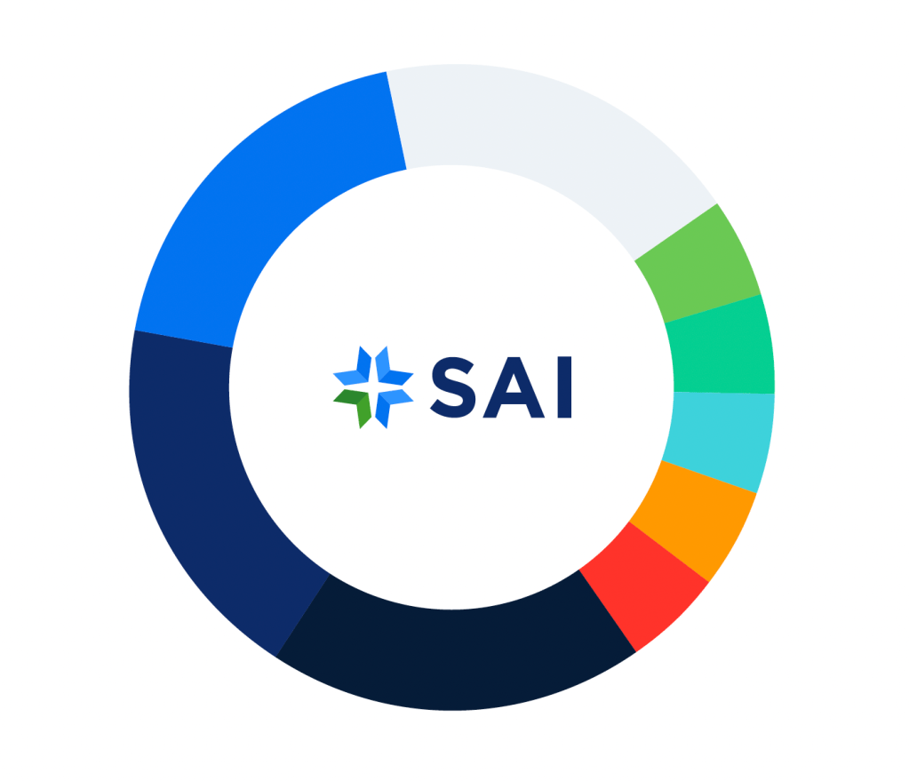
Color Palette
CEO alignment: Before diving into color selection, I met with the CEO to better understand the brand’s visual history. He emphasized that blue had long been the anchor color for SAI, and maintaining that visual connection was essential. In short: SAI is a blue brand, and that legacy needed to be preserved.
Reimagining blue: I began by auditing previous brand palettes, where a muted navy often dominated and dulled the overall aesthetic. To refresh the brand while honoring its roots, I introduced a more vibrant navy as the new SAI Blue. I then expanded the range with complementary blue tones to create a richer and more dynamic foundation.
Collaborative color exploration: With core blues established, I led a Microsoft Teams workshop to align on supporting colors. I advocated for a broad, purposeful palette that enables data visualization and hierarchy while defining SAI and its acquisitions within a cohesive system.
Final palette: Taking all inputs into account, the result is a flexible, modern palette that maintains brand heritage while enabling clear communication and visual storytelling.
Typography
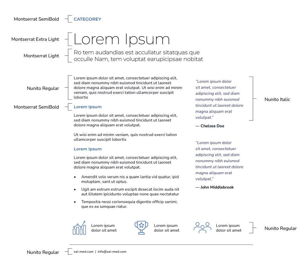
Defining the typographic style: First, I established a modern, clean, highly legible sans-serif direction to reflect clarity and expertise.
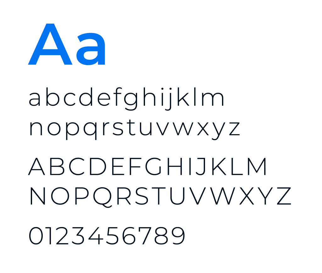
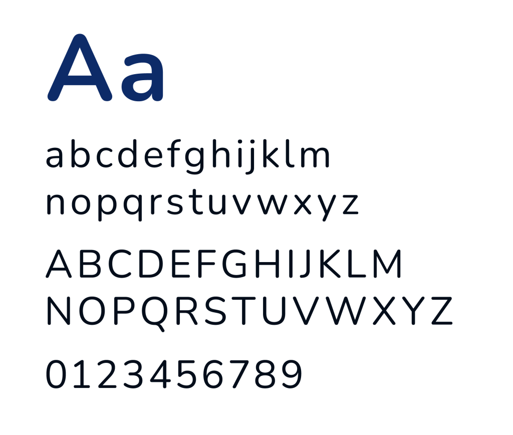
Selecting font families: I chose Montserrat for its geometric, contemporary structure and strong alignment with a modern, corporate tone. To improve readability in longer-form content, I paired it with Nunito for body copy, offering enhanced legibility and a more compact, text-friendly width.
Montserrat
Nunito
Establishing type hierarchy: With font families in place, I developed a clear system for how and when each typeface should be used. I created detailed guidelines covering font usage, sizing, leading, tracking, and kerning to ensure consistency across all brand communications. This structure helped establish a professional, polished typographic voice for the new SAI brand.
Visual Elements
To enable both creativity and brand consistency across designs and layouts, I developed a unified system of visual assets—including iconography, patterns, graphic vessels, and a defined photography style.
Iconography: I chose SAI’s iconographic style to embody the brand’s character through a simple, modern style designed for clarity and ease of communication.

Patterns: I developed a series of expressive patterns highlight the dynamic, insightful nature of SAI’s work, drawing inspiration from the two core elements of the logo—the arrow and the star.
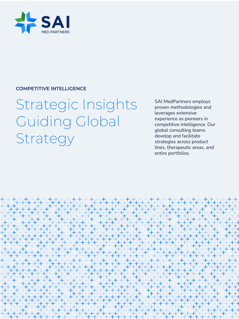

Shapes + Vessels: Graphic shapes serve as versatile tools to create unique layouts, emphasize key information, and strengthen brand identity. They can be integrated with photography, layered for visual depth, or used as background elements to add texture and interest. Shapes and vessels were designed using the arrow component from the logo and the 45 and 8-degree angles each arrow was constructed from.

Photography: Photography plays a vital role in bringing the SAI brand to life. I established three distinct photography categories to reflect the full spectrum of the brand: authentic and candid moments, industry-specific imagery, and scenic accent photography.

Solution Summary
To modernize and unify the SAI brand, I developed a comprehensive visual identity system grounded in strategy, exploration, and collaboration.
I began with the logo, exploring broad directions through low-fidelity sketches tied to SAI’s core industries. Through collaborative sessions with leadership, we aligned on a final concept and extended it into divisional logos for consistency across acquisitions.
I then expanded SAI’s signature blue into a flexible color palette to support data visualization and hierarchy. I paired Montserrat and Nunito to balance impact with readability, and built a strong supporting system of iconography, patterns, graphic vessels, and a structured photography framework.
Together, these updates created a cohesive, scalable brand system that strengthens clarity and consistency.
Reflection
Reflecting on the rollout, the new identity system has significantly streamlined my workflow by replacing ad hoc design decisions with a clear, flexible framework. Established rules for typography, color, and visual elements make it faster to produce consistent assets without revisiting foundational choices each time.
For the company, the system has made it much easier to stay on brand across teams and acquisitions. The guidelines are straightforward and accessible, enabling non-design stakeholders to confidently apply the identity while maintaining cohesion. As a result, brand execution is more consistent, efficient, and scalable across all touchpoints.
 Becca Humann