Encouraging Asthma and COPD Patients to build Healthier Habits
A huge hurdle at Propeller Health is keeping patients engaged. To combat this, I lead the development of an email campaign that linked their individual motivations to breathe better with features and benefits of the program.
Project: Engagement email campaign
My Role: Art direction, marketing, graphic design, illustration
Timeline: 6 weeks
Client: Propeller Health
Key Results: 60% increase in daily app interactions
Challenge
At Propeller Health, we understand the value our application brings in helping patients manage their respiratory health and breathe easier. However, maintaining long-term user engagement remains a significant challenge. While initial adoption is strong, engagement typically declines over time — by day 90, approximately 40% of users have stopped interacting with the app, and by day 180, that number climbs to over 60%.
This drop-off impacts more than just usage statistics: when patients disengage, their health can suffer, and client organizations begin to question the program’s effectiveness. The challenge lies in bridging the gap between the clinical benefits we know the program delivers and the value users perceive in their daily lives.
How can we tailor an email campaign to meet the diverse motivations, education levels, and learning preferences of our users — ultimately improving outcomes for patients and ensuring continued satisfaction for our clients?
Planning
Workshopping insights: To kick off the initiative, I hosted collaborative Zoom-based workshops with key stakeholders from our marketing and customer success teams. The goal was to better understand how different users learn and what motivates them to stay engaged.
We identified two primary learning styles among our users:
- Emotional learners who connect through relatable stories and personal experiences
- Logical learners who respond best to data, structure, and empirical evidence
User motivation fell into three core drivers:
- Gaining a better understanding of their flare-ups
- Avoiding unnecessary doctor or ER visits
- Returning to the activities they love
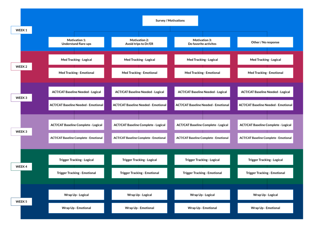
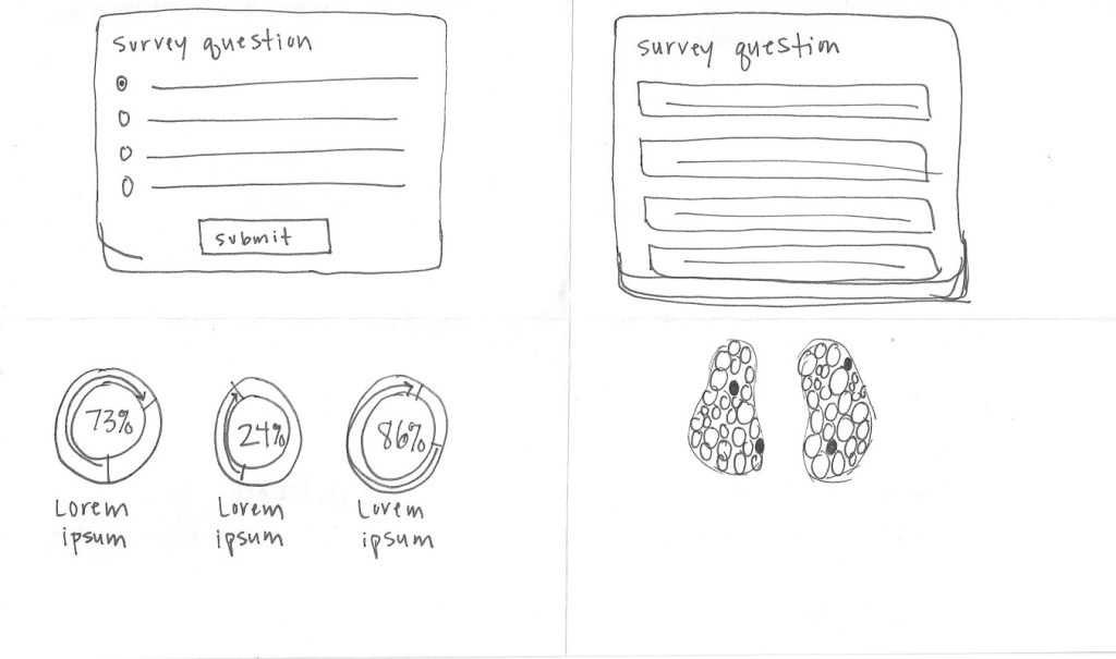
Campaign Strategy: With these insights, the next challenge was determining each user’s learning style and primary motivation. Since we didn’t yet have that data, we started the campaign with a short survey asking users to select the motivation that best aligned with their personal goals. Following this, each user received two emails: one tailored to an emotional tone and the other to a logical one — allowing us to observe which style resonated more.
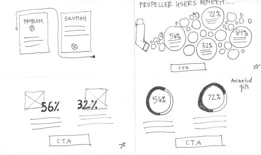
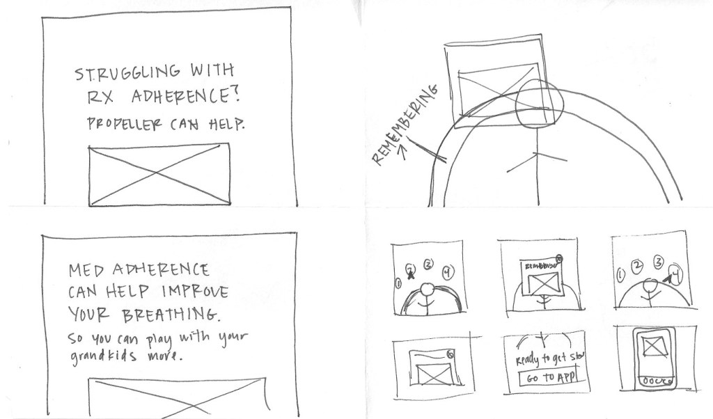
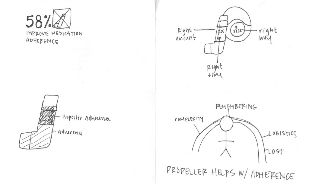
Content development: Next, we mapped key Propeller features — medication tracking, ACT/CAT scores, and trigger tracking — to each of the three motivations. This ensured each feature was framed in terms of how it could help users achieve their specific goals. By modularizing the content this way, we could keep the core structure of the emails consistent while dynamically customizing the motivational messaging. Additionally, we added a content block giving users a goal related to the email topic to further keep them engaged — “Record a dose in Propeller for the next three days” in the medication tracking email.
Campaign Schedule
The campaign was designed to run over five weeks, with users receiving two emails per week — one emotionally oriented and one logically driven:
- Week 1: Survey email + reminder
- Week 2: Medication tracking emails
- Week 3: ACT/CAT score emails (asthma/COPD assessments)
- Week 4: Trigger tracking emails
- Week 5: Wrap-up and reinforcement emails
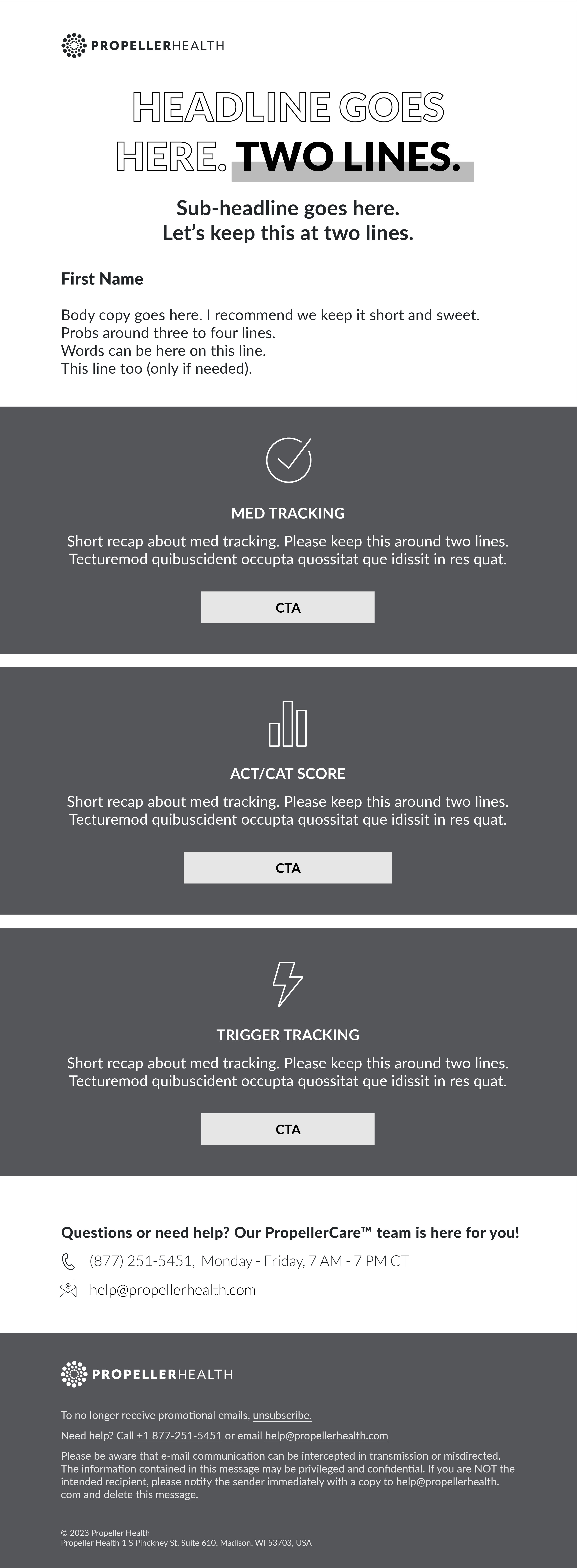
Layout and Design
Rapid sketching: While content development was underway, I began the design process with quick, timed sketching sessions — spending no more than 60 seconds per layout idea. This fast-paced approach helps spark creativity and encourages exploration without overthinking. From this pool of concepts, I selected the most promising sketches and refined them to align with the emerging content.
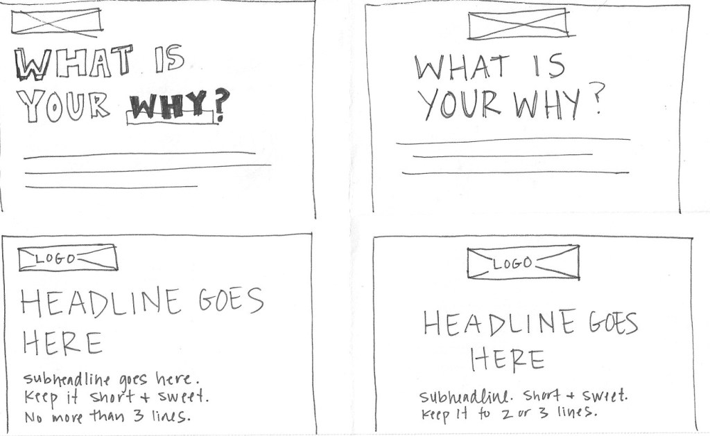


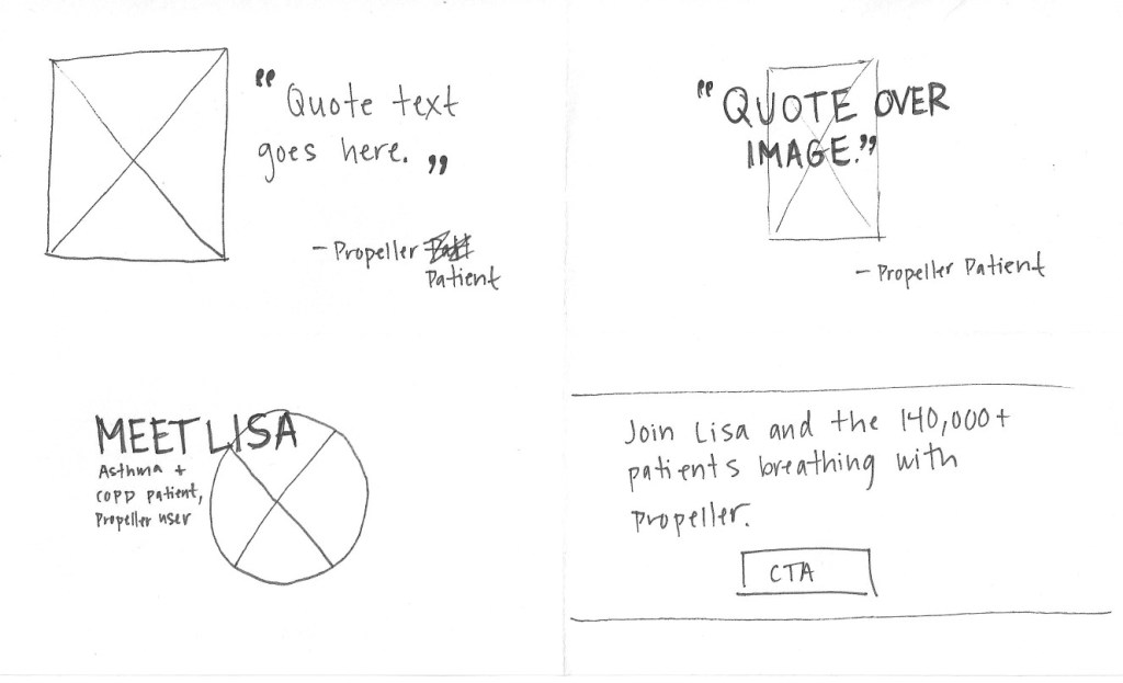
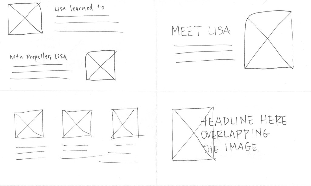

Wireframing: Once the initial sketches were narrowed down, I translated them into digital wireframes. Working intentionally in grayscale allowed me to focus solely on the structure, hierarchy, and flow of the content — ensuring a clean, user-friendly experience before layering in visual design elements.


Content collaboration: With the first draft of content in place, I hosted a collaborative workshop with the Senior Content Manager to review both the copy and the wireframes. This working session allowed us to refine our respective elements in tandem, ensuring strong alignment between design and message before moving into final production.
Final design execution: With approved copy and structure, I began crafting the final email layout s— introducing brand colors, imagery, illustrations, and supporting visual elements such as quotes. Accessibility was a key priority throughout the design process: all color choices adhered to WebAIM contrast guidelines, and each email was built responsively to ensure optimal performance across devices and screen sizes.

Survey Email 
Medication Tracking – Logical 
Medication Tracking – Emotional 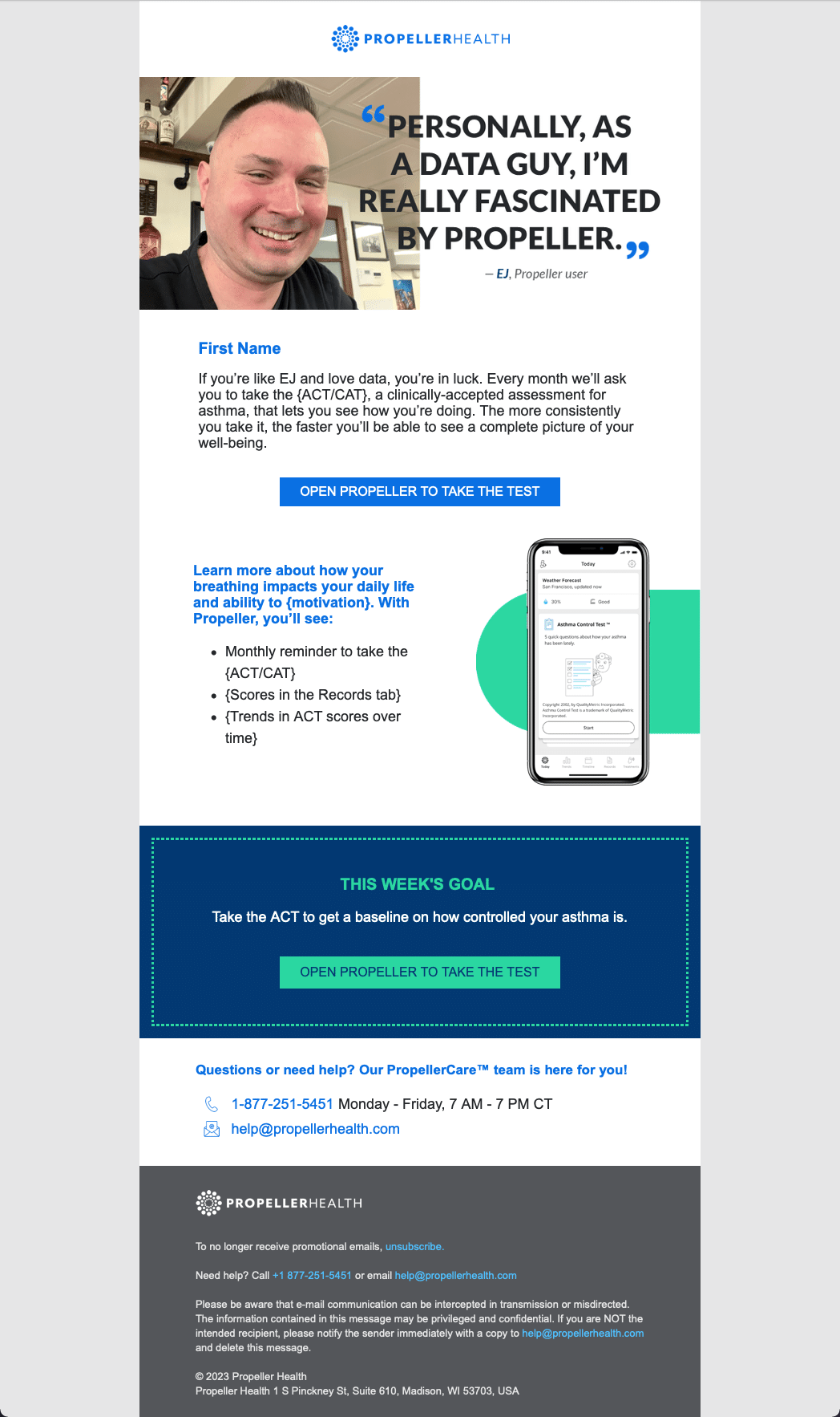
ACT/CAT Score Baseline Completed – Logical 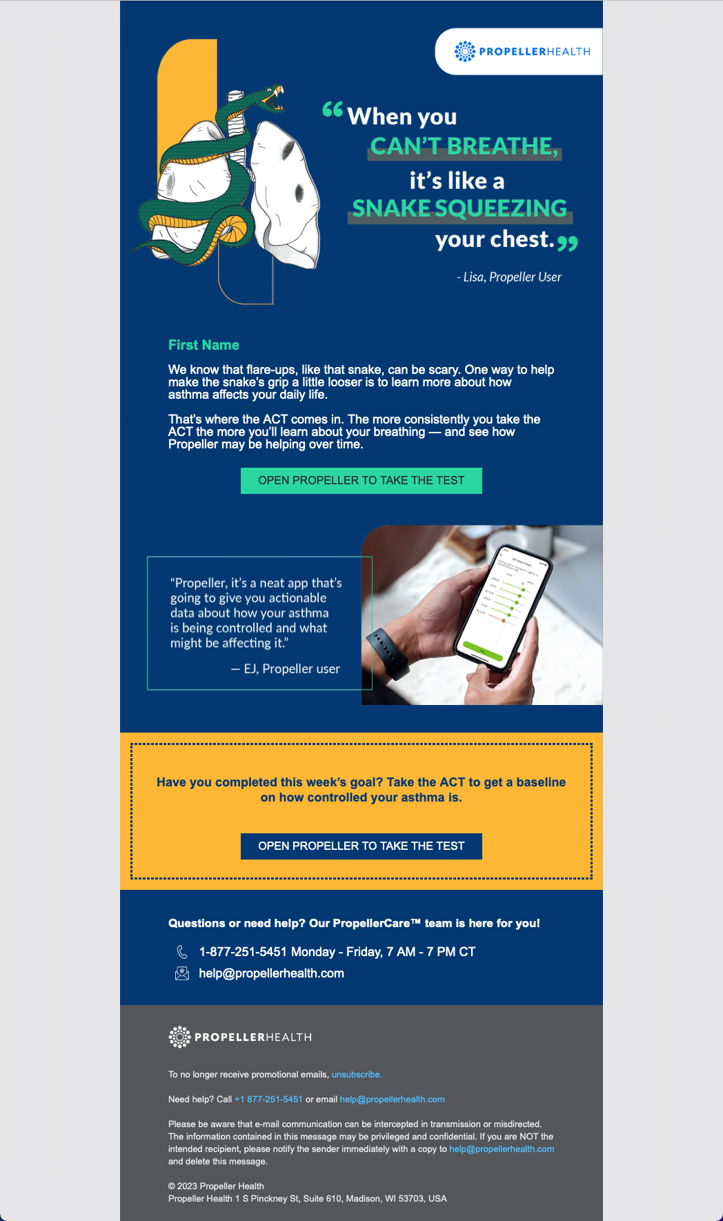
ACT/CAT Score Baseline Needed – Emotional 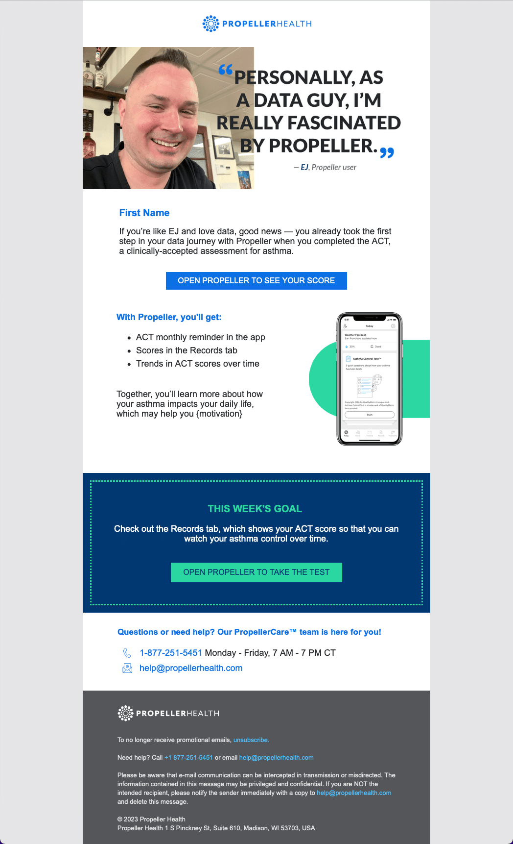
ACT/CAT Score Baseline Needed – Logical 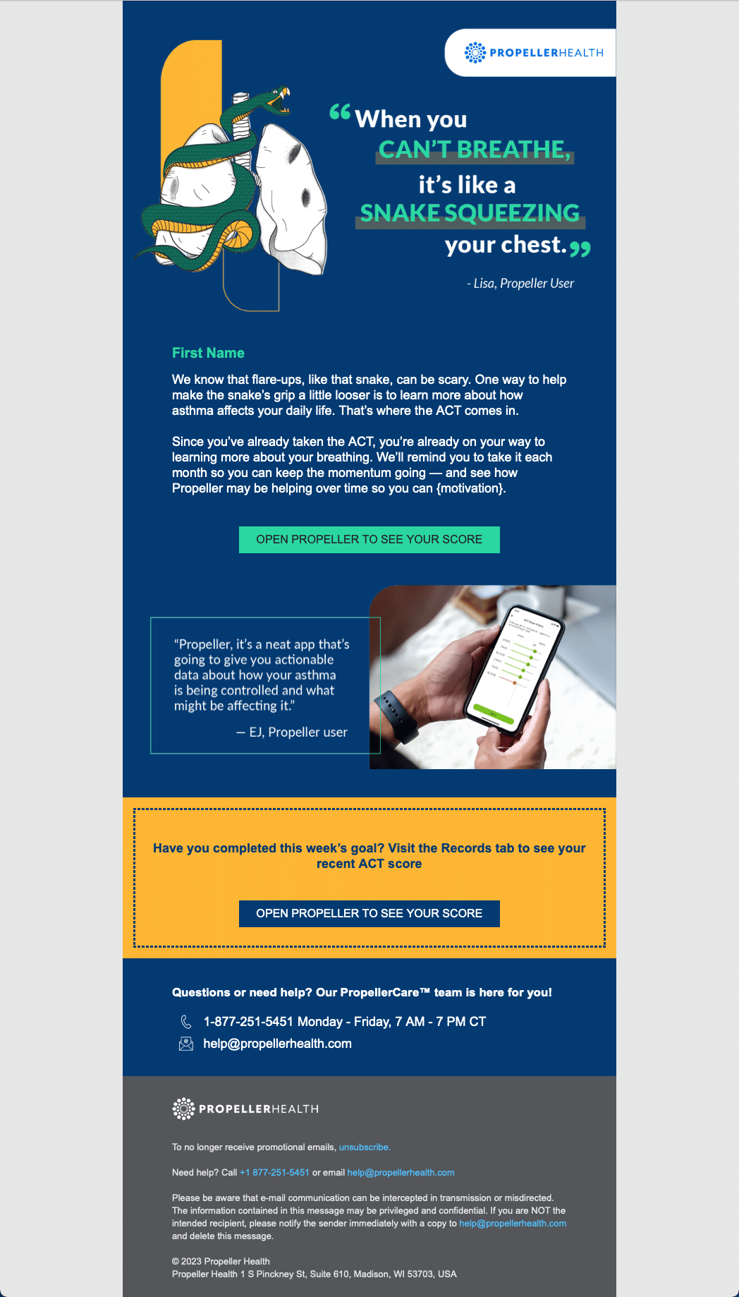
ACT/CAT Score Baseline Completed – Emotional 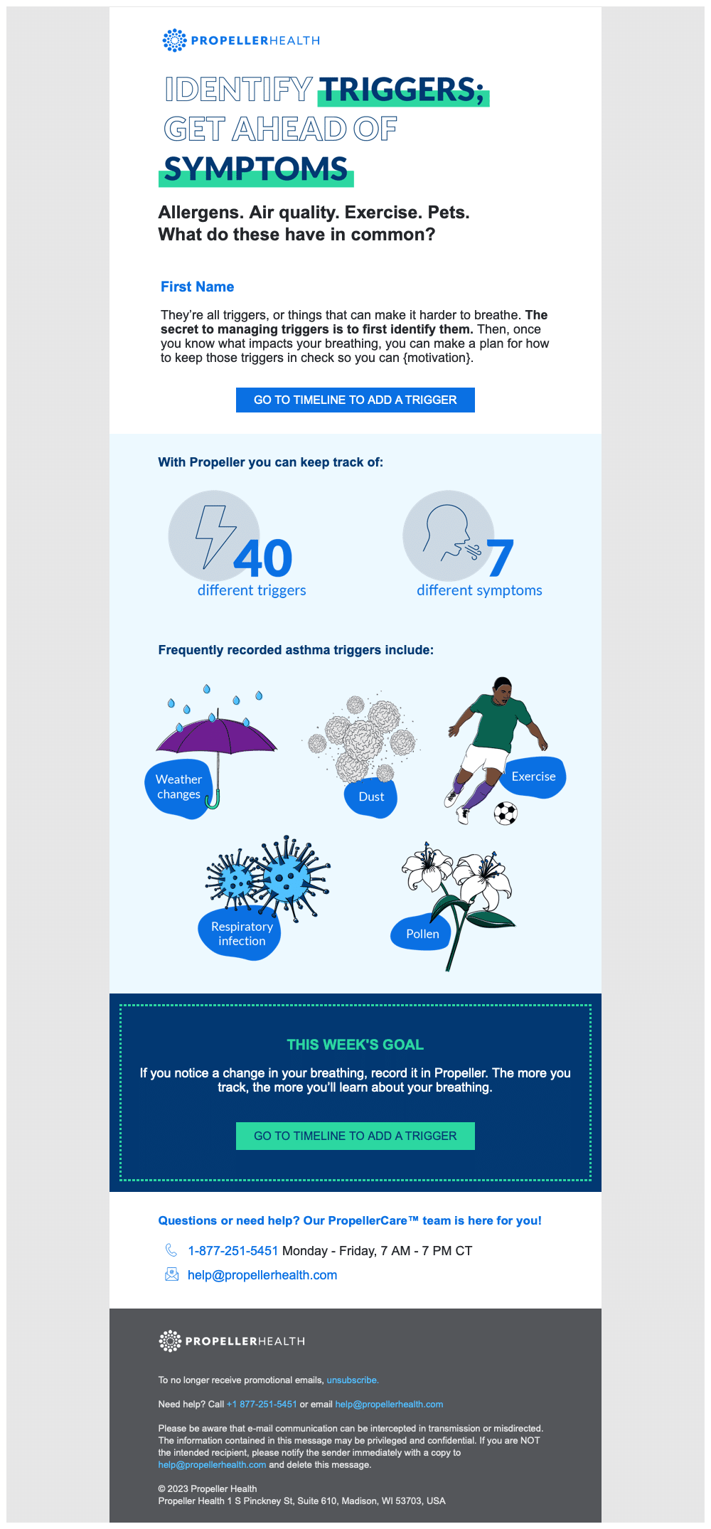
Trigger Tracking – Logical 
Trigger Tracking – Emotional 
Wrap-Up – Logical 
Wrap-Up – Emotional
Results
The campaign yielded very impressive results — both in terms of user engagement and client satisfaction.
Email open rates
The campaign achieved an average open rate of 47%, significantly higher than the industry average of 21% for healthcare emails. The initial survey email had the highest engagement, with a 56% open rate and 38% click-through rate.
Click-through rates
Across the five-week series, the emails saw an average click-through rate of 26%, indicating that users were not only opening the emails but also engaging meaningfully with the content.
App engagement
Most notably, the campaign contributed to a 60% increase in daily app interactions and a 30% improvement in user retention by day 90 compared to previous cohorts. The tailored emotional and logical messaging approach appeared to resonate with a broader user base.
Client Satisfaction
Feedback from client-facing teams indicated a notable improvement in client perception of Propeller’s value, with several partners citing the campaign as a key reason for contract renewals and expanded rollout.
