Creating Kiio’s Visual Identity
As an early stage start-up, a true brand identity was never fully realized and consisted of a mish-mash of elements. Kiio needed a modern and consistent brand image for customers and patients to recognize and trust.
| Project: | Create a new visual identity for Kiio |
| My Role: | Art direction, branding, graphic design |
| Timeline: | 3 months |
| Company: | Kiio Health |
Color Palette
My biggest challenge of this project was getting leadership to agree on a cohesive color palette that represented the brand and could be utilized with several use cases. The were several strong and conflicting opinions.
Kiio’s original color palette was limited, didn’t harmonize well, and didn’t accurately represent the Kiio brand: helpful, friendly, motivating, uplifting, trustworthy, and caring.
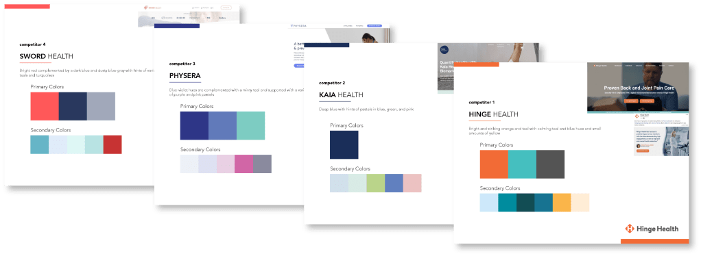
STEP 1: REVIEWING COMPETITOR PALETTES
I wanted Kiio’s brand to stand out against competitors, so it was important to see what our main comp set was doing. Blues were a prevalent color family that I wanted to avoid as a primary color.
Step 2: Creating Concept Palettes
With thoughts and feedback from leadership and board members in hand, I created conceptual palettes as a starting point.
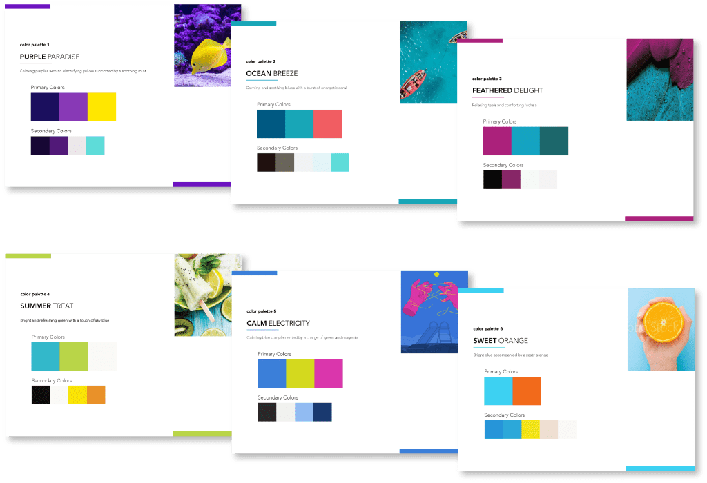
- Palettes 2 and 3 were cut (palette 2 for being too similar to a competitor and palette 3 for being too dark)
- Palettes 4 and 6 were very similar and combined to one concept
- Palette 5 was deemed too “funky” and cut as well
Between the remaining two concepts – purple and blue – I convinced stakeholders to go with purple. While it was outside of their comfort zones and quite different from the current color palette, they acknowledged blue would get lost in the sea of other blues in healthcare, and people would notice and remember purple.
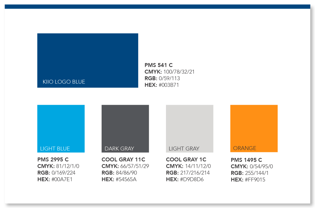
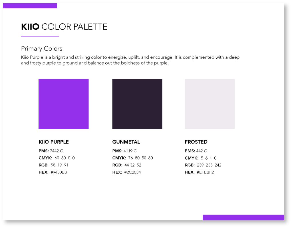
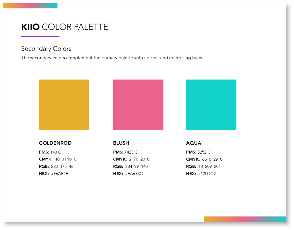
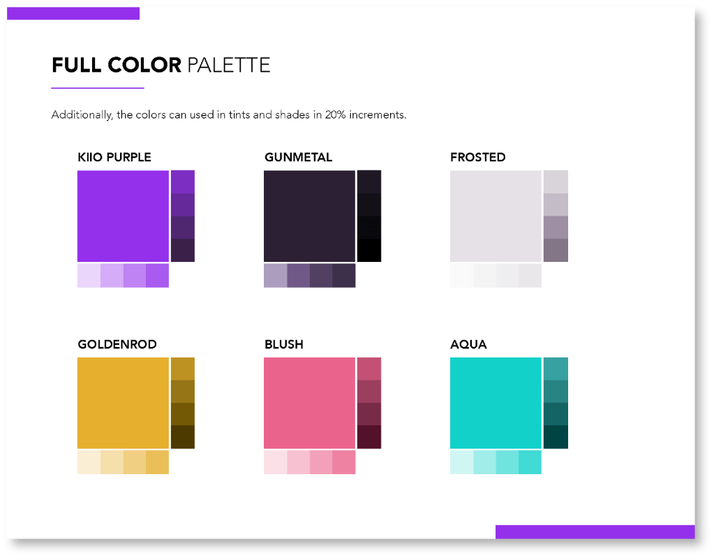
STEP 3: BUILDING THE FINAL PALETTE
Now that I had a clear path forward, I created the final palette.
Logo
Kiio’s original logo did not help consumers understand what type of company Kiio is.
Since Kiio is a startup with little brand recognition, I wanted to add “health” to the logo to make it immediately known what industry Kiio is in. It was important to leadership to add the tagline “feel relief” to the logo as well.
In addition to adding “health” and the tagline, I wanted to add a symbol to the logo to aid in brand recognition and to use for social media profile pictures.
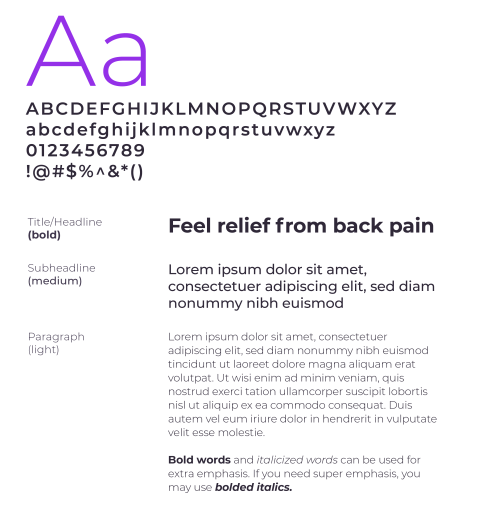
Typography
Kiio did not have an established brand font, and there were several fonts being used across the business. I wanted consistent font usage across all company communications, internal and external. It was important to use accessible, clean, and easy-to-read typefaces.
I chose Open Sans as the primary typeface for its neutral yet friendly appearance and legibility across web, mobile, and print.
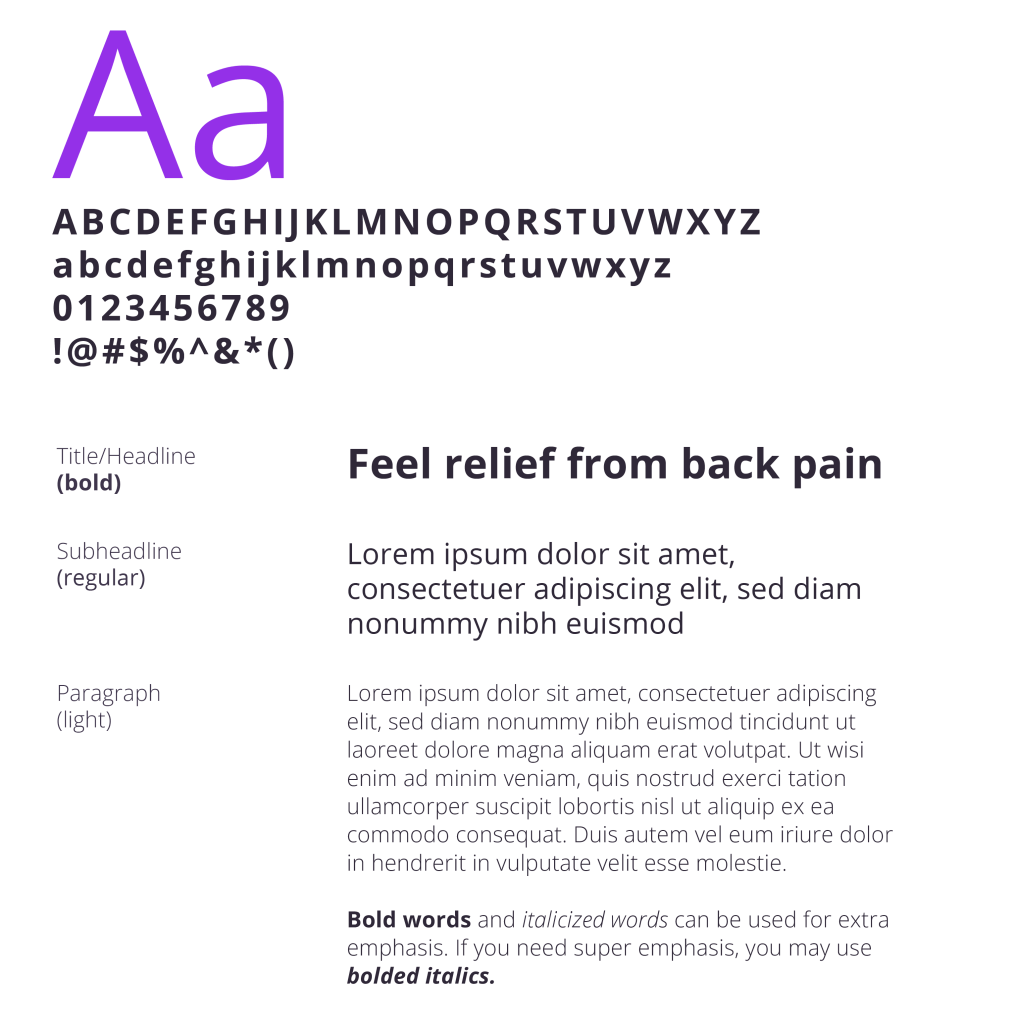
Montseratt was chosen as a secondary typeface for its functional, contemporary, geometric, and bold design.
It can be applied in a wide range of uses with high legibility. I wanted to have two typeface options for optimal design control and options.
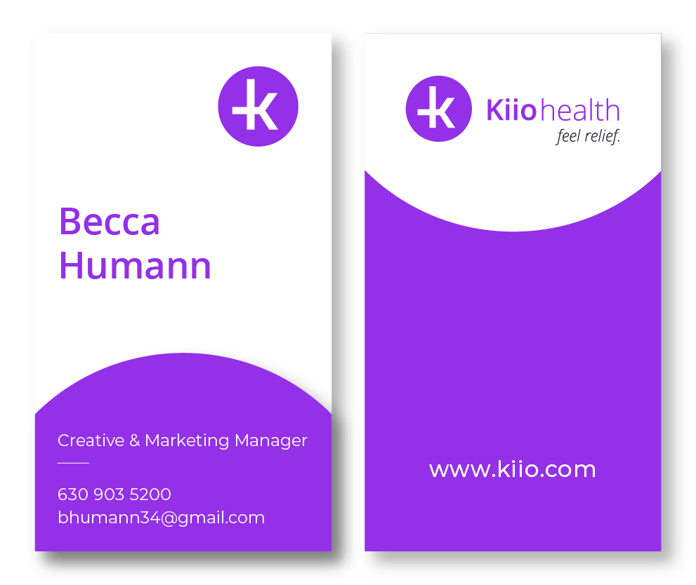
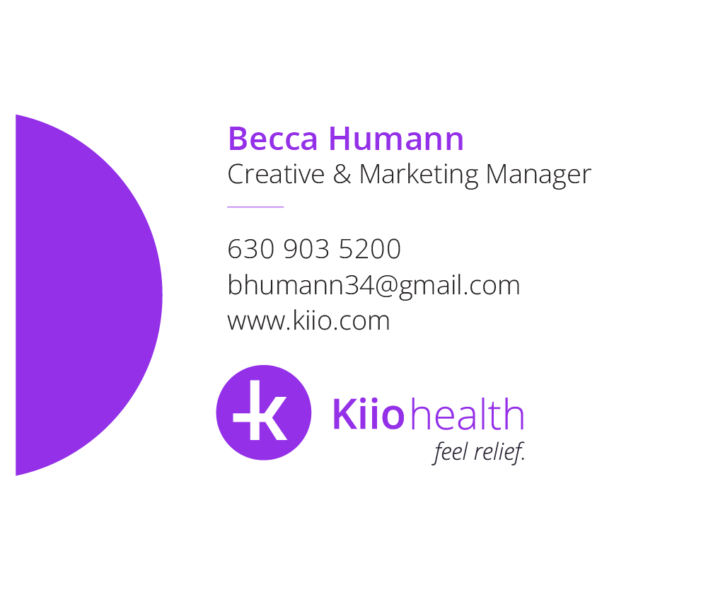
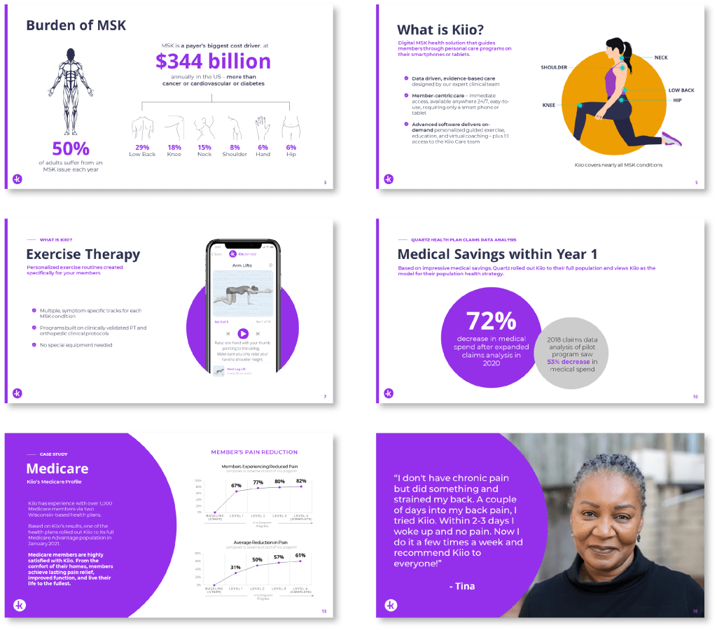
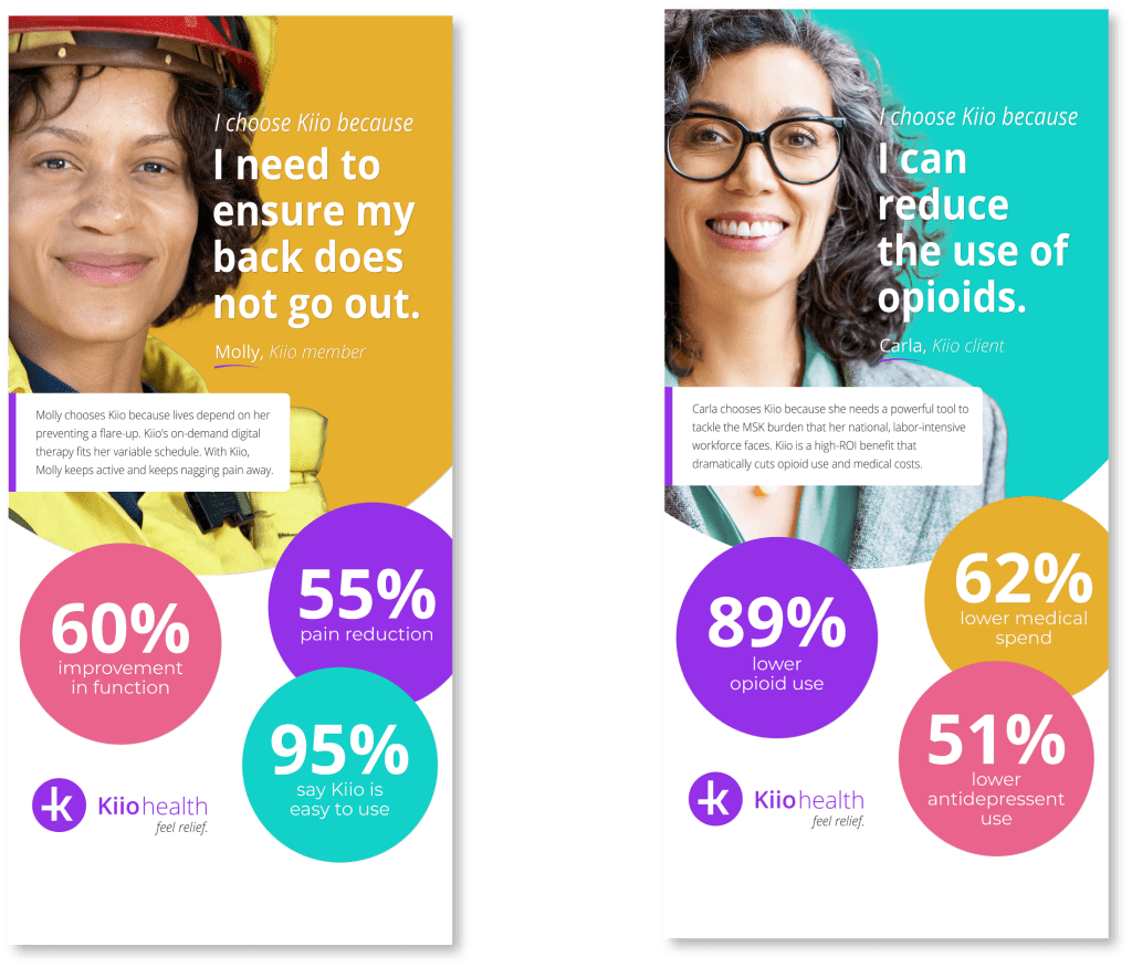
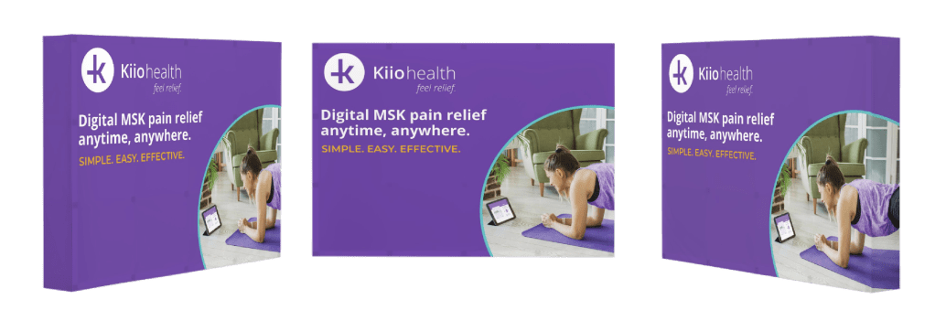
New Visual Identity in Action
A selection of new branded materials.